 Ai Basics
Aims
This course aims to give the user the tools to use to analyse data in the AI context.
The course covers the statistical methods that are employed to analyse data and find relationships.
Measuring the strength of relationships, one can then use the staistical model to make predictions
and give a measure of the confidence of the predictions.
Scenario
You are wanting to buy a secondhand car for your partner.
You have shown them a range of advertised cars and asked if they like the model.
You now have a list of cars likely to be liked and a hope to see if a newly advertised car is likely to be liked before you buy it.
Types of data
Data types can be divided into three main categories:
- Numerical
- Categorical
- Ordinal
Numerical data are numbers, and can be split into two numerical categories:
- Discrete Data: numbers that are limited to integers. Example: The number of cars passing by.
- Continuous Data: - numbers that are of infinite value. Example: The price of an item, or the size of an item.
- Categorical: data are values that cannot be measured up against each other.
Example: a color value, or any yes/no values. - Ordinal data: like categorical data, but can be measured up against each other.
Example: school grades where A is better than B and so on.
Measurements on data
Mean, Median, Mode Standard Deviation and Variance
There are 5 measures of interest in Machine Learning:
- Mean - The average value
- Median - The mid point value
- Mode - The most common value
- Standard Deviation - a measure of the spread or data points.
- Variance - measures how far each number in the set is from the mean.
Standard Deviation is often represented by the symbol Sigma: σ
Variance is often represented by the symbol Sigma Squared: σ 2 and is the square of the Standard deviation
Another measure used in ML is the percentile.
Percentiles are used in statistics to give you a number that describes the proportion
of the values are lower than the maximum value
Eg 10 readings - [10,20,30,40,50,60,70,80,90,100]
75% Percentile=70
ie every reading below and including 70 lies in the 75% region - [10,20,30,40,50,60,70]
| Age | Speed | Engine | Origin | Like |
|---|---|---|---|---|
| 5 | 99 | 1200 | FRANCE | NO |
| 7 | 86 | 1300 | GERMANY | YES |
| 8 | 87 | 1250 | JAPAN | YES |
| 7 | 88 | 3000 | ITALY | YES |
| 2 | 111 | 2000 | UK | YES |
| . | ||||
| . |
We will start by looking at the relationship between Age and Speed to illustrate some basic concepts.
For the car data the following metrics are computed:
mean x=7.03
mean y=91.96
median x=6.5
median y=92.5
mode x=ModeResult(mode=array([5]), count=array([3]))
mode y=ModeResult(mode=array([86]), count=array([3]))
standard deviation x=4.32
standard deviationy=15.27
variance x=18.72
variance y=233.26
75% percentile x=[9.]
75% percentile y=[102.]
75% quantile x=[9.]
75% quantile y=[102.]
slope=-3.01
intercept=113.20
r=-0.855
p=2.594e-08
std_err=0.37
Basic metrics code
#!/bin/shimport sys
import matplotlib
import matplotlib.pyplot as plt
import numpy as np
import pandas as pd
from scipy import stats #import statspackage from scipy for metrics functions
data = pd.read_csv("car-data.csv") #load data into a DataFrame object
df = pd.DataFrame(data)
print(df)
x = df['Age'].to_numpy() #convert Age and Speed to an array
y = df['Speed'].to_numpy() #speed
meanx=np.mean(x)
meany=np.mean(y)
medx=np.median(x)
medy=np.median(y)
modex=stats.mode(x,keepdims=True)
modey=stats.mode(y,keepdims=True)
sdx=np.std(x)
sdy=np.std(y)
varx=np.var(x)
vary=np.var(y)
pcx=np.percentile(x,[75])
pcy=np.percentile(y,[75])
qx75=np.quantile(x,[0.75])
qy75=np.quantile(y,[0.75])
print("meanx="+str(meanx))
print("meany="+str(meany))
print("medx="+str(medx))
print("medy="+str(medy))
print("modex="+str(modex))
print("modey="+str(modey))
print("sdx="+str(sdx))
print("sdy="+str(sdy))
print("varx="+str(varx))
print("vary="+str(vary))
print("pcx75="+str(pcx))
print("pcy75="+str(pcy))
print("qx75="+str(qx75))
print("qy75="+str(qy75))
stdev = np.std(y) # std deviation
print("stdev=" + str(stdev))
variance = np.var(x) #variance
print("variance=" + str(variance) )
percentile = np.percentile(x, 90) #percentile
print("percentile=" + str(percentile))
slope, intercept, r, p, std_err = stats.linregress(x, y) #
print("slope=" + str(slope) )
print("variance=" + str(variance) )
print("intercept=" + str(intercept) )
print("r=" + str(r) )
print("p=" + str(p) )
print("std_err=" + str(std_err) )
Visualising the data
A scatter chart
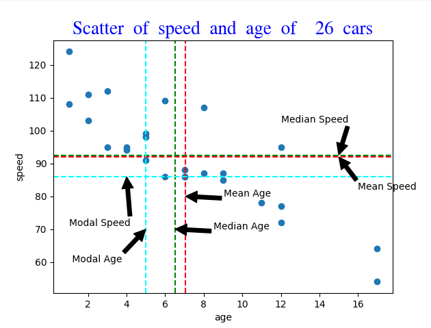
scatter chart code
#!/bin/shimport sys
import matplotlib
import matplotlib.pyplot as plt
import numpy as np
import pandas as pd
from scipy import stats #import statspackage from scipy for metrics functions
data = pd.read_csv("car-data.csv") #load data into a DataFrame object
df = pd.DataFrame(data)
x = df['Age'].to_numpy() #convert Age and Speed to an array
y = df['Speed'].to_numpy() #speed
dlength=len(x) # the size of the array
meanx=np.mean(x)
meany=np.mean(y)
medx=np.median(x)
medy=np.median(y)
modex=stats.mode(x,keepdims=True)
modey=stats.mode(y,keepdims=True)
font1 = {'family':'aakar','color':'blue','size':20} #define some fonts for the chart
font2 = {'family':'serif','color':'darkred','size':15}
font3 = {'family':'sans','color':'navy','size':15}
plt.scatter(x, y)
plt.axvline(x=meanx, color='red', linestyle='--') #
plt.axhline(y=meany, color='red', linestyle='--')
plt.annotate('Mean Age', xy=(meanx, 80), xytext=(meanx+2, 80), arrowprops=dict(facecolor='black', shrink=0.01))
plt.annotate('Mean Speed', xy=(15,meany), xytext=( 16,meany-10), arrowprops=dict(facecolor='black', shrink=0.01))
plt.axvline(x=medx, color='green', linestyle='--')
plt.axhline(y=medy, color='green', linestyle='--')
plt.annotate('Median Age', xy=(medx, 70), xytext=(medx+2, 70), arrowprops=dict(facecolor='black', shrink=0.01))
plt.annotate('Median Speed', xy=(15,medy), xytext=( 12,medy+10), arrowprops=dict(facecolor='black', shrink=0.01))
plt.axvline(x=modex[0], color='cyan', linestyle='--')
plt.axhline(y=modey[0], color='cyan', linestyle='--')
plt.annotate(' Modal Age', xy=(modex[0], 70), xytext=(modex[0]-4, 60), arrowprops=dict(facecolor='black', shrink=0.01))
plt.annotate('Modal Speed', xy=(4,modey[0]), xytext=( 1,modey[0]-15), arrowprops=dict(facecolor='black', shrink=0.01))
plt.xlabel("age")
plt.ylabel("speed")
plt.title("Scatter of speed and age of " + str(dlength) + " cars", fontdict = font1)
plt.show()
sys.stdout.flush()
A histogram chart
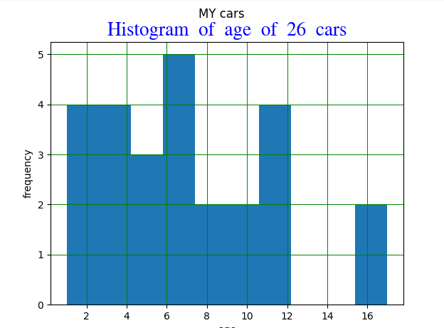
Histogram chart code
#!/bin/shimport sys
import matplotlib
import matplotlib.pyplot as plt
import numpy as np
import pandas as pd
#!/bin/sh
import sys
import matplotlib
import matplotlib.pyplot as plt
import numpy as np
import pandas as pd
from scipy import stats #import statspackage from scipy for metrics functions
data = pd.read_csv("car-data.csv") #load data into a DataFrame object
df = pd.DataFrame(data)
x = df['Age'].to_numpy() #convert Age and Speed to an array
y = df['Speed'].to_numpy() #speed
dlength=len(x) # the size of the array
font1 = {'family':'aakar','color':'blue','size':20} #define some fonts for the chart
font2 = {'family':'serif','color':'darkred','size':15}
font3 = {'family':'sans','color':'navy','size':15}
plt.hist(x)
plt.title("Histogram of age of "+ str(dlength) + " cars", fontdict = font1)
plt.xlabel("age")
plt.ylabel("frequency")
plt.grid(color = 'green', linestyle = '-', linewidth = 0.7)
plt.suptitle("CAR DATA")
plt.show()
sys.stdout.flush()
A bar chart
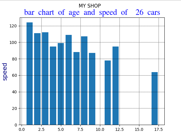
Bar chart code
#!/bin/shimport sys
import matplotlib
import matplotlib.pyplot as plt
import numpy as np
import pandas as pd
from scipy import stats #import statspackage from scipy for metrics functions
data = pd.read_csv("car-data.csv") #load data into a DataFrame object
df = pd.DataFrame(data)
x = df['Age'].to_numpy() #convert Age and Speed to an array
y = df['Speed'].to_numpy() #speed
dlength=len(x) # the size of the array
font1 = {'family':'aakar','color':'blue','size':20} #define some fonts for the chart
font2 = {'family':'serif','color':'darkred','size':15}
font3 = {'family':'sans','color':'navy','size':15}
plt.bar(x, y)
plt.title("Histogram of age of "+ str(dlength) + " cars", fontdict = font1)
plt.title("bar chart of age and speed of " + str(dlength) + " cars", fontdict = font1)
plt.xlabel("age", fontdict = font3)
plt.ylabel("speed", fontdict = font3)
plt.grid(color = 'black', linestyle = '--', linewidth = 0.5)
plt.suptitle("CAR DATA")
plt.show()
sys.stdout.flush()
Linear Regression
Linear regression uses the relationship between the data-points to draw a straight line through them all.
This line can be used to predict future values.
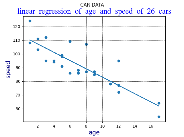
Linear_regression code
#!/bin/shimport sys
import matplotlib
import matplotlib.pyplot as plt
import numpy as np
import pandas as pd
from scipy import stats #import statspackage from scipy for metrics functions
data = pd.read_csv("car-data.csv") #load data into a DataFrame object
df = pd.DataFrame(data)
x = df['Age'].to_numpy() #convert Age and Speed to an array
y = df['Speed'].to_numpy() #speed
dlength=len(x) # the size of the array
font1 = {'family':'aakar','color':'blue','size':20} #define some fonts for the chart
font2 = {'family':'serif','color':'darkred','size':15}
font3 = {'family':'sans','color':'navy','size':15}
slope, intercept, r, p, std_err = stats.linregress(x, y)
def myfunc(x):
return slope * x + intercept
trendline = list(map(myfunc, x))
plt.scatter(x, y)
plt.title("linear regression of age and speed of " + str(dlength) + " cars", fontdict = font1)
plt.xlabel("age", fontdict = font3)
plt.ylabel("speed", fontdict = font3)
plt.grid(color = 'black', linestyle = '--', linewidth = 0.5)
plt.suptitle("CAR DATA")
plt.text(13, 110, "slope=" + str(round(slope,3)),
style='italic',
bbox={'facecolor': 'yellow', 'alpha': 0.5, 'pad': 10})
plt.plot(x, trendline)
plt.show()
R and R2measures
The R value is defined as:
rxy=(∑i=1n(xi−xˉ)2)*( ∑i=1n(yi−yˉ)2)___________________________________
(∑i=1n(xi−xˉ)*(yi−yˉ))-2
In English, this equation says take the average of all the x and y values multiplied together and divide by the the square root of all the averages which normalises the data between -1.0 and 1.0.
The result gives a measure of how close the data resembles a linear relationship between the x and y values.
- Exactly –1. A perfect downhill (negative) linear relationship
- –0.70. A strong downhill (negative) linear relationship
- –0.50. A moderate downhill (negative) relationship
- –0.30. A weak downhill (negative) linear relationship
- 0. No linear relationship
- +0.30. A weak uphill (positive) linear relationship
- +0.50. A moderate uphill (positive) relationship
- +0.70. A strong uphill (positive) linear relationship
- Exactly +1. A perfect uphill (positive) linear relationship
R2 makes the R value always positive, so the value shows if the data has no relationship: R2=0, if R2=1, then there is a perfect relationship between the x and y values.
Logistic Regression
If the data points clearly will not fit a linear regression then a polynomial regression coulld be better.
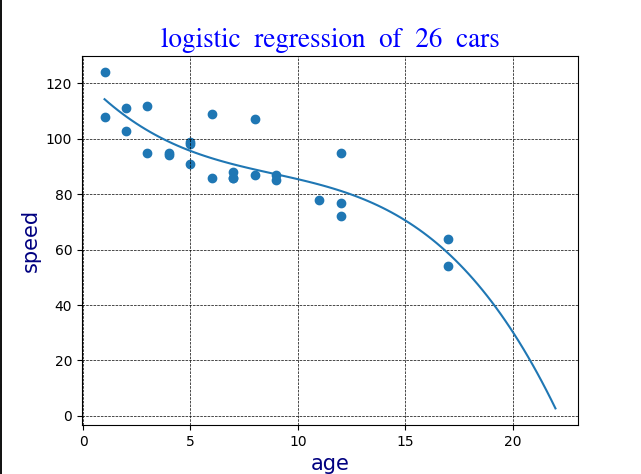
Logistic regression code
#!/bin/shimport sys
import matplotlib
import matplotlib.pyplot as plt
import numpy as np
import pandas as pd
from scipy import stats #import statspackage from scipy for metrics functions
data = pd.read_csv("car-data.csv") #load data into a DataFrame object
df = pd.DataFrame(data)
x = df['Age'].to_numpy() #convert Age and Speed to an array
y = df['Speed'].to_numpy() #speed
dlength=len(x) # the size of the array
font1 = {'family':'aakar','color':'blue','size':20} #define some fonts for the chart
font2 = {'family':'serif','color':'darkred','size':15}
font3 = {'family':'sans','color':'navy','size':15}
#logistic regression
mymodel = np.poly1d(np.polyfit(x, y, 3))
myline = np.linspace(1, 22, 100)
plt.scatter(x, y)
plt.title("logistic regression of " + str(dlength) + " cars", fontdict = font1)
plt.xlabel("age", fontdict = font3)
plt.ylabel("speed", fontdict = font3)
plt.grid(color = 'black', linestyle = '--', linewidth = 0.5)
plt.plot(myline, mymodel(myline))
plt.show()
sys.stdout.flush()
Polynomial Regression
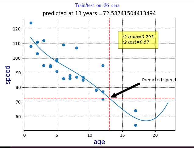
Polynomial regression, like linear regression, uses the relationship between the variables x and y to find the best way to draw a line through the data points.
Polynomial regression code
#!/bin/shimport sys
import matplotlib
import matplotlib.pyplot as plt
import numpy as np
import pandas as pd
from sklearn.metrics import r2_score #import the r2 score function
from scipy import stats #import statspackage from scipy for metrics functions
data = pd.read_csv("car-data.csv") #load data into a DataFrame object
df = pd.DataFrame(data)
x = df['Age'].to_numpy() #convert Age and Speed to an array
y = df['Speed'].to_numpy() #speed
dlength=len(x) # the size of the array
font1 = {'family':'aakar','color':'blue','size':20} #define some fonts for the chart
font2 = {'family':'serif','color':'darkred','size':15}
font3 = {'family':'sans','color':'navy','size':15}
#train test
train_x = x[:19]
train_y = y[:19]
test_x = x[19:]
test_y = y[19:]
mymodel1 = np.poly1d(np.polyfit(train_x, train_y, 4))
r2train = r2_score(train_y, mymodel1(train_x))
print("r2 train=" + str(r2train))
r2test = r2_score(test_y, mymodel1(test_x))
print("r2 test=" + str(r2test))
print("predicted at 13 years =" + str(mymodel1(13)) )
myline = np.linspace(1, 22, 100)
plt.plot(myline, mymodel1(myline))
#xy crosshairs
plt.axvline(x=13, color='red', linestyle='--')
plt.axhline(y=mymodel1(13), color='red', linestyle='--')#mymodel train
plt.suptitle("Polynomial regresssion on " + str(dlength) + " cars", fontdict = font1)
plt.title("Train/test predicted at 13 years =" + str(mymodel1(13)))
plt.xlabel("age", fontdict = font3)
plt.ylabel("speed", fontdict = font3)
plt.grid(color = 'black', linestyle = '--', linewidth = 0.5)
plt.text(15, 110, "r2 train=" + str(round(r2train,3)) + "\n" +
"r2 test=" + str(round(r2test,3)),
style='italic',
bbox={'facecolor': 'yellow', 'alpha': 0.5, 'pad': 10})
plt.annotate('Predicted speed', xy=(13, mymodel1(13)), xytext=(18, 84),
arrowprops=dict(facecolor='black', shrink=0.05))
plt.scatter(x, y)
plt.show()
sys.stdout.flush()
Multiple Regression
Multiple regression is like polynomial regression, but with more than one independent value, meaning that we try to predict a value based on two or more variables.
Standardising Data : Scaling and Normalisation
When your data has different values, and even different measurement units,
it can be difficult to compare them.
What is speed compared to country? Or age compared to capacity?
The answer to this problem is scaling.
Scaling involves dividing the all the values by the maximum value of the data set.
In this for the data is said to be normalised.
The reverse of this process is called unnormalizing
Evaluating the Model
In Machine Learning we look at the predictions made by the majority of the data and compare these values with the results from a subset of the data.
Typically we take 80% of the data to train the model, and 20% of the data to test the model.
Train/Test
If the two sets of data give very similar results for the relationship then we can use the model to predict values from new data.
If r2test ~=R2train can proceed with model and we can use the model to predict future values.
Standaridize data
d = {'UK': 0, 'USA': 1, 'N': 2} df['Nationality'] = df['Nationality'].map(d) d = {'YES': 1, 'NO': 0} df['Like'] = df['Like'].map(d) Then we have to separate the feature columns from the target column. The feature columns are the columns that we try to predict from, and the target column is the column with the values we try to predict. In the example "Like" is the target column, the remainder are feature columns
Decision Tree
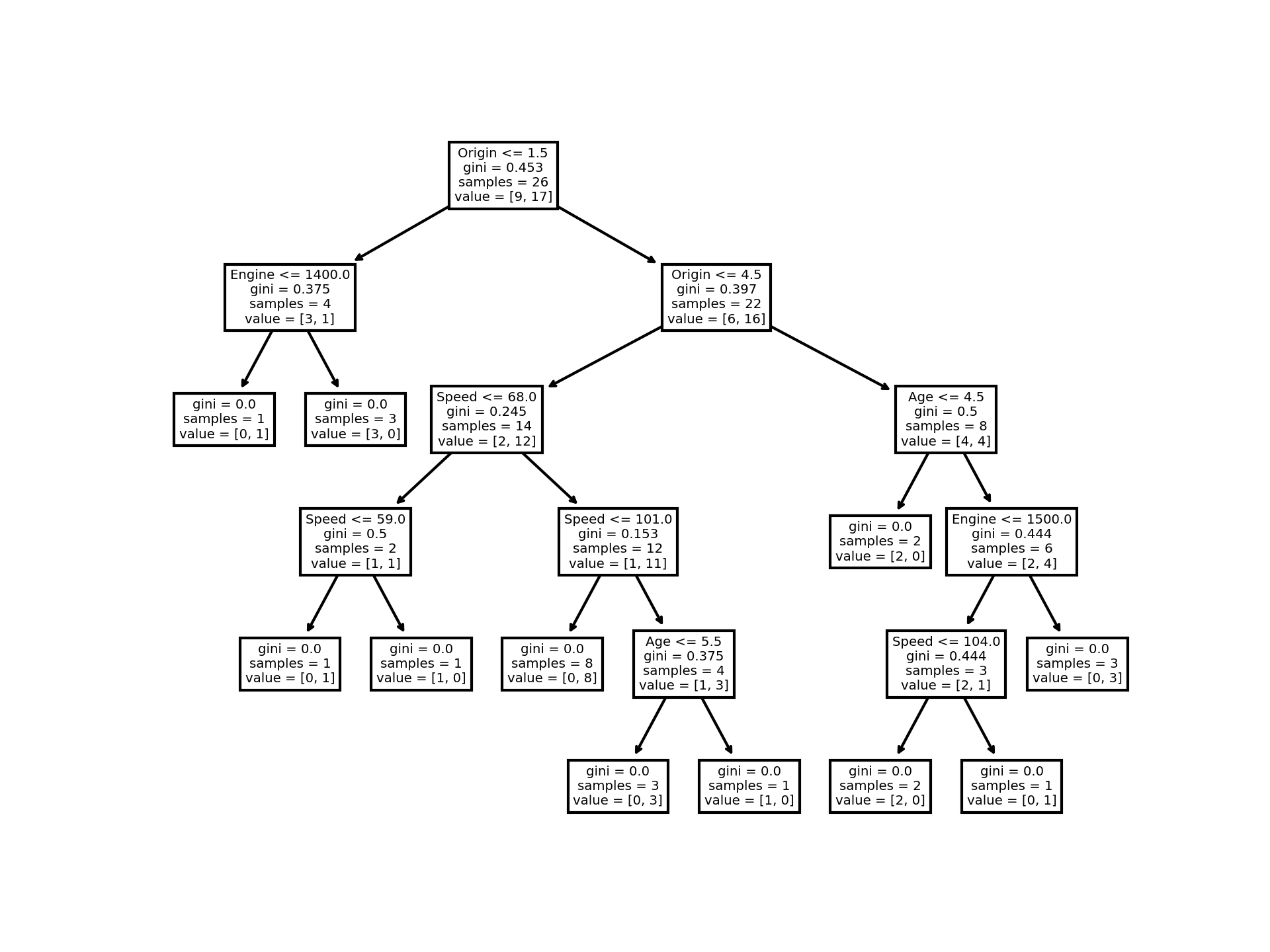
A decision tree is a sequential filter which looks at each feature in turn and assesses the number of samples which pass the
a certain test, and splits the results into "passes" and "fails".
Then each "pass" and "fail" is asssessed agianst the next criteria until no further samples can be split,
ie there are either no "passes" or 100% passes at which point the process stops.
In our example we look at a 14 year old car with a top speed of 82, and an engine 1100cc from the UK.
Decision tree code
#!/bin/shimport sys
import matplotlib
import matplotlib.pyplot as plt
from PIL import Image
import pandas as pd
from sklearn import tree
from sklearn.tree import DecisionTreeClassifier
data = pd.read_csv("car-data.csv") #load data into a DataFrame object
df = pd.DataFrame(data)
x = df['Age'].to_numpy() #convert Age and Speed to an array
y = df['Speed'].to_numpy() #speed
d = {'UK': 0, 'USA': 1, 'UK': 2, 'JAPAN': 3, 'GERMANY': 4, 'ITALY':5, 'FRANCE': 6}
df['Origin'] = df['Origin'].map(d)
d = {'YES': 1, 'NO': 0}
df['Like'] = df['Like'].map(d)
features = ['Age', 'Speed', 'Engine', 'Origin']
X = df[features]
y = df['Like']
matplotlib.use('Agg')
dtree = DecisionTreeClassifier()
dtree = dtree.fit(X, y)
tree.plot_tree(dtree, feature_names=features)
file = "dtree.png"
plt.savefig(file,dpi=300)
img = Image.open(file).resize((600,800))
img.show()
img.close()
plt.close('all')
The algorithm randomly selects a feature to start, and proceeds to evaluate for each of the other features.
The Decision Tree starts with the Origin.
It looks at all the cars with an Origin <=1.5
Including the target sample, it finds 9 cars out of the 26 from the USA or UK.
Applying the GINI formula, this gives a value of 0.453
A value of 0.0 would mean all of the samples got the same result,
and 0.5 would mean that the split is done exactly in the middle.
So in this case almost half the samples will get a "pass" and half "fail" and this is what we see: a roughly 2:1 split -9 pass and 17 fail.
So a 1/3 pass and 2/3 fail the test.
Moving down the "pass" arm, the 9 samples form the first filter are then assessed for engine size <=1400
This yields 3 cars passing and 1 fail. Applying the GINI formula to the remaining sets yields only 1 pass and 3 fail with a
GINI of zero so no futher splits are possible - [1,0] and [3,0].
Moving down the "fail" arm of the diagram, we have 22 samples (26 -4 from the "pass" arm).
These are assessed on the basis of Origin <4.5 which gives 6<=4.5 and 16>4.5.
These samples are then assessed against Age for pass/fail, and the process is repeated for each feature until there can be no further splits (GINI=0).
Different Results
You will see that the Decision Tree gives you different results if you run it enough times,
even if you feed it with the same data.
That is because the Decision Tree does not give us a 100% certain answer.
It is based on the probability of an outcome, and the answer will vary.
The Confusion matrix
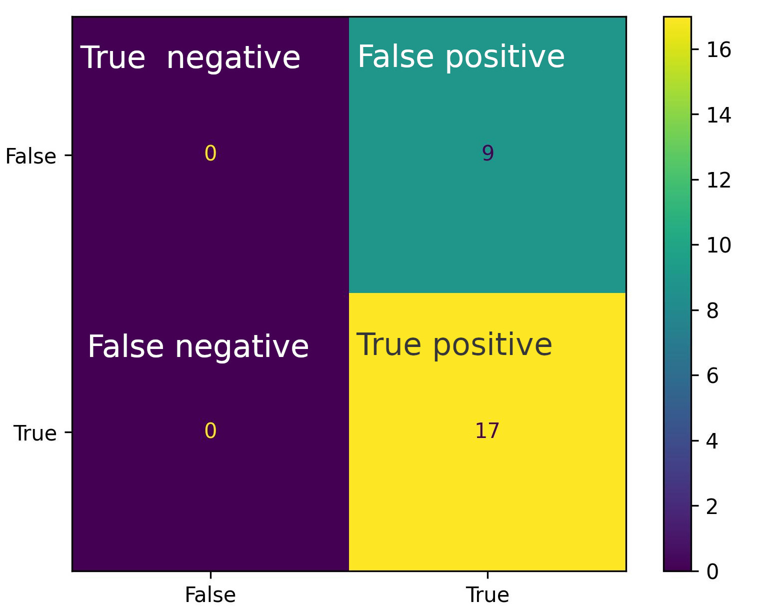
The Confusion matrix is a table that is used in classification problems to assess where errors in the model were made.
Predictions for a 14 year old car with a top speed of 82, and an engine 1100cc from the UK
Confusion matrix code
#!/bin/shimport sys
import matplotlib
matplotlib.use('Agg')
import matplotlib.pyplot as plt
import numpy
import pandas as pd
from sklearn import metrics
from sklearn import tree
from sklearn.tree import DecisionTreeClassifier
from scipy import stats #import stats package from scipy for metrics functions
from PIL import Image
data = pd.read_csv("car-data.csv") #load data into a DataFrame object
df = pd.DataFrame(data)
x = df['Age'].to_numpy() #convert Age and Speed to an array
y = df['Speed'].to_numpy() #speed
dlength=len(x) # the size of the array
d = {'UK': 0, 'USA': 1, 'UK': 2, 'JAPAN': 3, 'GERMANY': 4, 'ITALY':5, 'FRANCE': 6}
df['Origin'] = df['Origin'].map(d)
d = {'YES': 1, 'NO': 0}
df['Like'] = df['Like'].map(d)
features = ['Age', 'Speed', 'Engine', 'Origin']
X = df[features]
y = df['Like']
dtree = DecisionTreeClassifier()
dtree = dtree.fit(X, y)
twelve_predictions=[]
for i in range(dlength):
pr=dtree.predict([[14, 82, 1100, 0]])
twelve_predictions.append(pr[0])
print("prediction " + str(i) +" = " + str(pr[0]))
actual = df['Like'].to_numpy()
predicted = twelve_predictions
confusion_matrix = metrics.confusion_matrix(actual, predicted)
cm_display = metrics.ConfusionMatrixDisplay(confusion_matrix = confusion_matrix, display_labels = [False, True])
cm_display.plot()
#Two lines to make our compiler able to draw:
plt.savefig(sys.stdout.buffer)
sys.stdout.flush()
cm_display.plot()
plt.savefig('cmatrix.jpg',dpi=300)
img = Image.open('cmatrix.jpg').resize((800,600))
img.show()
sys.stdout.flush()
img.close()
plt.clf()
plt.cla()
plt.close('all')
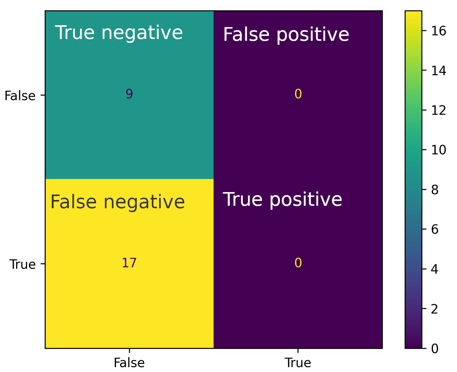
The diagram shows a plot of the actual true and false values along the x-axis against the predicted true and false values on the y-axis.
- The bottom right quadrant shows the cases where the predicted true values match the actual true values from the training data.
- The top left quadrant represents the cases where the predicted false values match the actual false values from the training data.
- The bottom left quadrant represents where the predicted true values do not match the actual false values from the training data - ie false positives.
- The top right quadrant represents where the predicted false values do not match the actual true values from the training data - ie false negatives.
In our example it shows the confidence in the car being 'liked' or 'not liked' and the colours show the confidence of the prediction: yellow indicates a very strong correspondence
and purple a weak correspondence.
Predictions for a 5 year old car with a top speed of 100, and an engine 4500cc from the USA
Confusion matrix metrics
Once we have a Confusion Matrix, we can calculate different measures to quantify the quality of the model
in terms of
Accuracy - (True Positive + True Negative) / Total Predictions
Precision - Of the positives predicted, what percentage is truly positive?
Sensitivity - (sometimes called Recall) measures how good the model is at predicting positives.
Specificity - How well the model is at prediciting negative results? Similar to sensitivity,
but looks at it from the persepctive of negative results.
F1-score - F-score is the "harmonic mean" of precision and sensitivity.
It considers both false positive and false negative cases and is good for imbalanced datasets.
The module sklearn contains the functions that can calculate the various metrics based on the actual/predicted data.
from sklearn import metrics
from sklearn.metrics import r2_score
The metrics are then available as follows:
Accuracy = metrics.accuracy_score(actual, predicted)
Precision = metrics.precision_score(actual, predicted)
Sensitivity_recall = metrics.recall_score(actual, predicted)
Specificity = metrics.recall_score(actual, predicted, pos_label=0)
F1_score = metrics.f1_score(actual, predicted)
For our example we get:
Accuracy= 0.653
Precision=0.653
Sensitivity_recall= 1.0
Specificity=0.0
F1_score=0.7906
So, in our example, we have an ~65% accuracy with a sensitivity of 1.0, so we can say the model is reasonably accurate and good at predicting positive results.
The F1 score is ~79% which shows the model has a fairly strong ability to distingguish between positive and negative results.
Once we have these metrics for the model, then we can assess what the model needs to make it more accurate. In our case, we only have relatively few results.
By getting more data points it would be expected that the metrics would improve and become more accurate.
Ideally, more than 100 data points would be a good starting point for a reliable model, and increasing data points to over 200 would mean there would be much more training and test data
from which the model can draw predictions.
Conclusion
The techiques outlined above show how to analyse data for single and multi-variant data and how to visualise and analyse the data to describe the confidence in the predictions.